

🎨 Shaping Perception with Color in Photographic Art

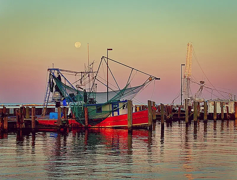
Shrimping On The Gulf
How color quietly directs emotion, meaning, and the viewer’s inner experience
Color is one of the most powerful forces in photographic storytelling—yet it often works in silence. Before a viewer interprets subject, composition, or symbolism, their subconscious has already reacted to the palette. As a travel photographer and visual storyteller, you’re not just capturing scenes; you’re shaping how others feel them. Color becomes your emotional architecture.
🌈 Color as the First Language of Perception
Long before the mind analyzes an image, the body responds to color. Warm hues pull the viewer inward; cool tones create distance. Saturated palettes energize; muted tones soothe. This immediate emotional response is why color is often called the first language of visual perception.
In photographic art, color isn’t decoration—it’s direction. It guides the viewer’s emotional journey through the frame.
🔥 Warm vs. Cool: The Emotional Temperature of an Image
Color temperature shapes the mood of a photograph more than most people realize.
Warm Tones — reds, oranges, yellows
Evoke energy, passion, vitality
Create intimacy and immediacy
Suggest sunlight, heat, and human connection
Cool Tones — blues, greens, violets
Convey calm, contemplation, or melancholy
Create emotional distance
Suggest night, water, or introspection
A bustling market bathed in golden light feels alive and communal. The same scene rendered in cool blue becomes reflective, even solitary. The subject hasn’t changed—only the emotional lens through which we experience it.

🎭 Color as Narrative and Symbol
Every photograph tells a story, and color is one of its most persuasive narrators.
High saturation amplifies drama, joy, or intensity.
Desaturated palettes evoke nostalgia, memory, or quiet reflection.
Monochromatic schemes focus attention on form and emotion.
Contrasting colors create tension, dynamism, or symbolic duality.
Think of color as the emotional score beneath your visual symphony. It sets the tone long before the viewer consciously interprets the scene.
🌍 Cultural Color Codes in Travel Photography
Color carries different meanings across cultures.
For example:
White symbolizes purity in some cultures and mourning in others.
Red can represent luck, danger, or celebration depending on context.
As a travel photographer, understanding these cultural layers deepens your storytelling. You’re not just capturing a place—you’re capturing the emotional and symbolic world that place inhabits.

✨ Color as a Spiritual and Emotional Bridge
For photographers who work at the intersection of art, psychology, and spirit, color becomes a bridge between the visible and the felt.
Gold and white can evoke transcendence.
Deep blues and purples suggest mystery and inner wisdom.
Earth tones ground the viewer in the physical world.
Used intentionally, color becomes a way to communicate “spirit to spirit,” allowing the viewer to feel the essence of a moment rather than simply observe it.
🧪 Practical Ways to Shape Perception with Color
A few techniques to deepen your color storytelling:
1. Shoot with a palette in mind
Before pressing the shutter, ask: What emotional temperature do I want this image to carry?
2. Use color contrast to guide the eye
A single red object in a muted scene becomes a visual magnet.
3. Explore color grading as emotional sculpting
Post‑processing is where color becomes intentional. Subtle shifts can transform the entire emotional register of an image.
4. Let color support your narrative
If the story is about serenity, lean into cool tones. If it’s about human connection, warm the palette.
🌟 Final Thoughts
Color is one of the most profound tools in photographic art. It shapes perception, evokes emotion, and guides meaning. When used with intention, it becomes a powerful storyteller—one that speaks directly to the viewer’s inner world.
For a photographer whose mission is to inspire unique perception and emotional resonance, mastering color isn’t just a technique. It’s a pathway to deeper, more soulful storytelling.